Question: What are the top three boroughs with the highest number of residential evictions executed in the last 12 months (from August 2024 to July 2025), and how do their eviction trends compare month-over-month during that period? Break it down by identifying any seasonal patterns, the most active marshals in those boroughs, and potential correlations with community boards or NTAs that stand out as hotspots.
Step by step analysis.
NOTE: Eviction data based off of publicly accessible data provided by the City of New York. Resources linked below.
Step 1.) Download the CSV file and import it directly to a Google Spreadsheet. Sheet made available to everyone:
https://docs.google.com/spreadsheets/d/1OVPZxIg9Kf1Y8SwGit6lncJFmnmfIHYHF1g5vEXX1D0/edit?usp=sharing

Step 2.) Cleaning and sorting the data.
Reasoning: I'm looking to get the data that's relevant to the all months from August 2024, to July 2025. There's several fields that aren't super relevant to the question at hand, so they can be removed. More importantly, we can set up a filter for the dates specified.
Spreadsheet copied over to a new tab to ensure an archive of the full data as of August 10th, 2025.

- Removed unnecessary columns
- Created a filter to display only rows from dates
- Trim white space from Resident/Commercial columns
- Created filter to display only residential evictions
- Added filters to other columns to not include empty cells
- Removed duplicate rows
- Created column for combined marshal first and last names
- Updated Borough names for consistent naming across all cells using the trim function, creating a new cell, then pasting plain text over existing cell.
- Repeated Trim function from above for all other columns to ensure consistency
- Validated date data by ensuring all dates are in proper and consistent formatting by creating a new row and using function (Validated, then removed function column)
- Acknowledged inconsistencies in eviction apartment numbers, i.e cells labeled as 1ST FLOOR, 1,1ST FLOOR, 3A AKA 301. Generally these would be cleaned up by removing trailing white spaces, and removing anything with a space in it, removing prefixes, and ensuring a consistent naming format. The issue with removing these, is that the apartments that are labeled incorrectly, are still apartments that were evicted during the expected timeframe. Removing them would lead to incorrect analysis. The eviction still exists, even if the apartment number is incorrect. For this reason, I've opted to not clean this column, and instead allow the data to remain for the sole purpose of retaining accurate eviction numbers.

To resolve this, a formula was used to sort the eviction apartment numbers. Those that followed a proper protocol, and those that were invalid. This formula expected apartment numbers to follow #X format, or similar variations and returned four results: The correctly formatted and current existing apartment number, INVALID, or a #VALUE (Only numeric values) error, or a hyphen in instances where apartments only had a hyphen in the apartment number. These are flagged for manual review.

- Created a new column to label the dates by season, based off of month.
- Added conditional color formatting for each season. Yay, appropriate colors!

Below is a how my cleaned data looks!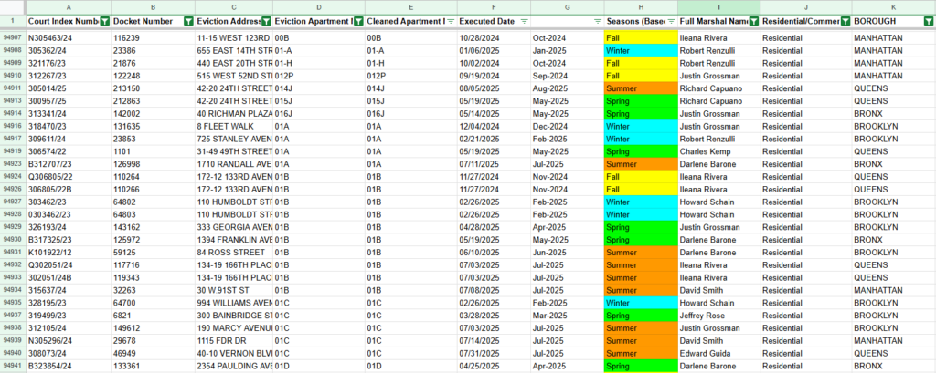
Step 3.) With the data cleaned, it's time to start creating a data viz. To start, I make an easy to read pivot table, shown below.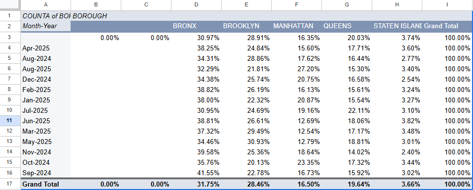
As a small note, it's really easy to remember the order for these percentages. Conveniently, the highest to lowest percentage of eviction dates corresponds with our alphabetical order.

Step 4.) Next I go ahead and create an actual chart. Google Spreadsheets typically recommends a pretty good chart based off of the data you're using, and the recommended stack column chart works well enough; but it can use some edits still.

- It needs a nice short title
- Pivot table dates are set alphabetically, not chronologically. I realized this and fixed that, but it changed the layout of the pivot table slightly, shown below.
The pivot table now lists the start of each month as the rows, rather than being labeled as August 2024. This does of course, in turn update the chart as well, but that's still being adjusted to look pretty anyways.

Back to the chart

- The chart now has a title, fixed dates on the X axis, and some colors for the bars and it looks fairly complete, however, this chart alone doesn't tell the story for what I'm looking to get an answer for. I still need to know the seasonal relationship to the eviction rates, as well as other factors. To begin reading these relationships, I create more pivot tables for the seasons, marshal names, community boards, and NTAs, each in their own separate organized tab.

I know have a pivot table and a graph showing corresponding information for the eviction dates, seasons, NTA, Community Boards, Marshal's, and the NTA compared to Marshal's.

With this, I can begin to cover the questions asked. It's reposted below for anyone reason.

What are the top three boroughs with the highest number of residential evictions executed in the last 12 months (from August 2024 to July 2025), and how do their eviction trends compare month-over-month during that period? Break it down by identifying any seasonal patterns, the most active marshals in those boroughs, and potential correlations with community boards or NTAs that stand out as hotspots.
Question 1.) What are the top three boroughs with the highest number of residential evictions executed in the last 12 months (from August 2024 to July 2025)
This question is the simplest, and easiest to identify. To answer this question, I simply refer to my spreadsheet tab with my evictions per month data and view the grand totals at the bottom.

Bronx: 31.75%
Brooklyn: 28.46%
Queens: 19.64%

These three combined make up 79.64% of the evictions from the five boroughs.

These are the top 3 most evicted boroughs from August 2024, to July 2025. The chart pivot table is displayed below for reference.
Then we follow up this premise with answering how their trends follow on a month over month period.
To answer this question, I simply duplicate my exist tab (to not replace the existing chart) and change the chart from a bar chart to a line chart.
From the chart below we can gather several metrics.
- Evictions in the Bronx are consistently above all other Boroughs, regardless of month.
- Bronx evictions while consistently higher, are steady.
- Brooklyn saw a sharp increase of evictions starting in November 2024, increasing consistently until May 2025 where eviction rates began to dwindle down.
- Bronx typically evictions go up as Brooklyn evictions go down.
- Manhattan evictions began to decline after the winter and into the spring, but broke above their average value (17.18%) after June with a 19.16% eviction rate in July. We can assume the trend is likely to continue based off of the existing data for August, but August is inconclusive so far.
- Despite the large spike in evictions starting in July, Manhattan had the sharpest decline in evictions.
- Queens saw a steady increase of eviction rates starting November 2024, eventually breaking above its average eviction rate (16.88%) in March 2025, seeing a large spike in evictions in July. However, the current eviction rate for August indicates that it will decline, though this is inconclusive currently.
- Staten Island had the most stable eviction rate with very little fluctuations. Staten Island's total eviction rate was 3.66% with its average being 3.26%.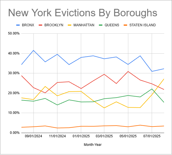
Next we want to review the seasonal data. Below are my pivot table and chart for the seasonal relationships.

- From the pivot table, we can see that the spring and summer have basically the same total number of eviction rates, with only 5 difference.
- Spring and summer have the highest eviction rate at 26.76% and 26.80% respectively
- Winter has the lowest eviction rate at 22.49%. Perhaps because more businesses are hiring for seasonal work, leading to higher employment.
- Fall has the second lowest eviction rate. Similar employment idea as winter - higher temp and seasonal hiring.
- Weather conditions may have an impact on eviction rate depending on the seasons. For example, being evicted in the summer (assuming homelessness after) is far more tolerable than in the cold weather conditions of Winter. 

I also want to compare data between the Marshal's, Community Boards, and NTA's. To do this, I can begin looking at my Marshal data. Let's start with the Marshal's.

Taking a look at the chart, we can tell a few things immediately.

- Justin Grossman, David Smith, and Edward Guida must just be AWFUL at parties. They also have the highest eviction rate with a shared percentage of 51.55% of all evictors.
- Of all of the 193 NTA's, Justin Grossman has evictions in all but 11 of them (94% presence)
- David Smith has evictions in all but 19 of the NTA's (90.2% presence)
- Edward Guida had evictions in all but 33% of the NTA's (82.9% presence)
From here, I wanted to dive deeper into other potential for this data to answer questions. To begin, I took several other steps.

- Created a new tab in the spreadsheet called "Stats".
- Queried data from the Docker Number, Boroughs, Seasons, and Month-Year columns.
- Filtered the query to remove blank data (The query pulls the entire tab, not just the filtered content)
- Added helper column for seasons to label them numerically
- Inserted pivot table into the new "Stats" tab. NTA in rows, Full Marshal Names in Columns, and COUNTA Docket Numbers in values.
- Add a filter for boroughs, excluding Queens and Staten Island (Two lowest eviction rates)
- Oddly enough, adding this filter actually broke the pivot table. This didn't allow for the grand totals to be displayed for some reason. To resolve this I created a new pivot table in a blank tab and filtered the boroughs. This worked, but copying and pasting that data back to the Stats tab removed the grand total once again.
- Since the table did not want to display in my Stats tab, I pasted the pivot table from the new tab as plain text, and just added some borders. It's ugly but hey it works, lol.
Note: This took several hours to create the work around. I spent more time focusing on why the issue even happened in the first place. Another notable solution would be to possibly take the filtered data, copy it, and paste it to a new tab as plain text, removing the filters, then creating a pivot table with that data instead.
- Create a % of Grand Total column next to pivot table. We'll come back to this later
- Next I decide to correlate seasonal evictions to boroughs. To do this, I import the data from my seasonal tab by simply copying and pasting the pivot table data in my stats tab below my existing pivot table.
- Next I run the CORREL function to check the correlation between evictions and seasons. We can see the results below.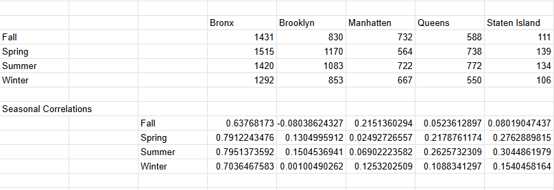
- Now I view the coefficients of the correlations. From the data I can safely assume several things:
     1.) There is a moderate correlation between Spring, Summer, and Winter evictions in the Bronze
     2.) There is no correlation to seasonal evictions in Brooklyn, and in the case of Fall, even a negative correlation.
     3.) Manhattan evictions have a negligible, or no correlation to the seasons.
     4.) Queens has a moderate correlation to evictions in the Fall, and a weak or no correlation  to the other seasons.
     5.) Staten Island has a weak or no correlation to seasonal evictions.
     6.) The highest correlation for all evictions was in the summer, followed by the fall. After spring. Correlations then drop dramatically in the fall, and rise in the winter, though winter remains well below the Spring and Summer correlations.

Based off of this information, it's safe to conclude that evictions happen most frequently from March through August, or Spring through Summer.

Next I'll go ahead and tackle the NTA/Marshal information.

Returning to the % of the grand total from my pivot table consisting of NTA's, Marshal's, with values from the docket number and filtered by the top 3 boroughs, we can infer several things. We can start by sorting these percentages by ascending and descending order and then referencing the percentages.

     1.) Central Harlem North-Polo Grounds has the highest recorded eviction rate at 3.10%. The four following NTA's to create the top 5 leading eviction rates are Mount Hope (2.55%), East New York (2.41%), East Concourse-Concourse Village (2.37%), Bedford Park-Fordham North AND Crown Heights North (Both 2.35%).
     2.) The five LOWEST eviction rates were located in Park Cemetary ETC Brooklyn (0.01%), Windsor Terrace (0.04%), Park Cemetary ETC Bronx (0.05%), Brooklyn Heights-Cobble Hill (0.08%), and Prospect Heights (0.11%)
     3.) With the leading 6 NTA's (Accounting for the two tied at 2.35%), the combined total of the eviction rates is a staggering 15.13%, suggesting some sort of inequalities in those NTA's and confirming them as hotspots for Marshal's.
     4.) The bottom five NTA's combined only make up 0.29% of evictions, confirming these to be cold spots for activity. This also suggests inequalities that could broaden the data.
- For further analysis, we'll consider that >2% eviction rate to be a critical hotspot, <2% OR >1% to be moderate and "emerging", and <1% to be low activity. With this in mind, we have:
     - 9 critical hotspots for our NTA's
     - 25 Moderate or emerging locations
     - 82 low activity NTA's

- To evaluate the NTA's compared to Marshal's, we'll compare the top six (two with shared eviction percentage) NTA's with the top 5 Marshal's. 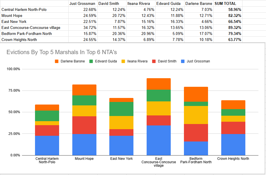
To begin, I go ahead and calculate the totals. This is simple.

- Calculate the percentage of evictions in each NTA by the Marshal. This is calculated with Marshal/Total Evictions.
- Adjust the numeric output to a percentile

Now we have our totals written into the spreadsheet and a graph created with the data. In this graph and the spreadsheet data, we can see several inferences.

     1.) East Concourse-Concourse Village has the highest eviction rate between these top 5 Marshal's, with the five of them adding up to a staggering 89.32% of the eviction in this NTA.
     2.) Not far behind East Concourse, Mount Hope also has a combined 82.32% of all evictions from these five Marshal's alone.
     3.) All of the top six NTA's have over a 50% eviction rate from these five Marshal's.
     4.) The average eviction rate per top 6 NTA's per Marshal is Justin Grossman (24.15%), David Smith (14.52%), Ileana Rivera (12.75%), Edward Guida (11.15%), and Darlene Barone (10.78%). Justin Grossman leads with nearly double the eviction rate of David Smith.
With my analysis completed, I feel it's finally time to come to a conclusion and answer the initial questions. To recap, these were the initial questions.
What are the top three boroughs with the highest number of residential evictions executed in the last 12 months (from August 2024 to July 2025), and how do their eviction trends compare month-over-month during that period? Break it down by identifying any seasonal patterns, the most active marshals in those boroughs, and potential correlations with community boards or NTAs that stand out as hotspots.
Breaking everything down.
1.) What are the top three boroughs with the highest number of residential evictions executed in the last 12 months?
This question is simple to answer. The top three boroughs with the highest number of residential evictions were the Bronx (31.75%), Brooklyn (28.46%), and Queens (19.46%).
2.) How do their eviction trends compare month-over-month during that period?
Trends imply that as evictions in the Bronx go down, evictions in other boroughs go up. Manhattan, Brooklyn, and Queens trends tend to go up after the end of the year, starting in November, and begin tapering down starting the following July. The Bronx follows an up-down trend, but stays within a fairly consistent 10% range that can be correlated to trends in other boroughs going up.
3.) Breaking it down with seasonal trends.
In correlation to our trends over time, we can see that eviction rates go down in the fall, reaching their bottom in the winter before beginning to rise in the spring and climax in the summer. This falls in line with the spike in evictions in the Bronx in June (38.81%, Summer), Brooklyn's spike in May (30.93%, end of spring, start of summer), the peak in evictions in Queens in July (22.11%, Summer), the large surge in evictions, almost doubling in Manhattan between June and August (12.69% -> 27.20%, Summer), and the subtle increase in evictions in Staten Island starting in May (Spring leading into Summer).
4.) Break it down by the most active marshal's in those boroughs and potential correlations with community boards or NTA's that stand out as hotspots.
Finally, we can conclude the top six NTA's have over 50% eviction rates from the top 5 most active Marshal's: Justin Grossman (Average 24.15% evictions), David Smith (14.52% Average evictions), Ileana Rivera (12.75% Average evictions), Edward Guida (11.16 Average evictions), and Darlene Barone (10.78% Average evictions).
Additionally, we can conclude there are nine NTA's that can be considered "hotspots" for activity with the Marshal's with over 2% eviction rates, capping out at 3.10%. There are 25 moderate or emerging NTA's with 1-2% eviction rates, and 82 low activity NTA's with less than 1% eviction rates.
Additional conclusions: Based on the evidence in the data, I would suggest redirecting aide to the hotspot NTA's like Central Harlem North Polo, Mount Hope, and East New York during the Spring and Summer. It will be worth monitoring NTA's longer to see if it has any impact on other locations that may have aide redirected away from them. Monitor for spikes in NTA's over the coming months, especially in the summer and spring. If aide is redirected, we should also consider looking for seasonal changes, including increases in evictions during months where evictions generally trend down. This should be monitored year-over-year.
And in closing, thanks for coming to my TED talk.Resources:
CSV File Download Link: https://catalog.data.gov/dataset/evictions
Publisher: City of New York (via data.cityofnewyork.us)
Link To My Spreadsheet: https://docs.google.com/spreadsheets/d/1OVPZxIg9Kf1Y8SwGit6lncJFmnmfIHYHF1g5vEXX1D0/edit?usp=sharing